Featured projects
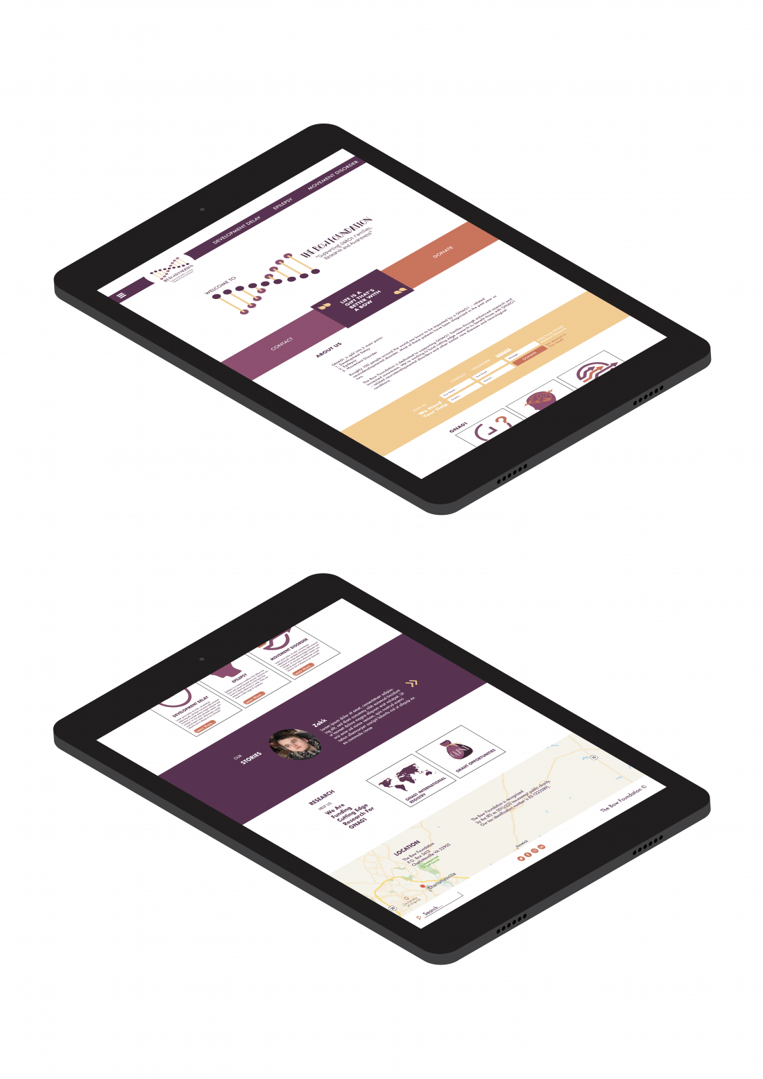
The Bow Foundation: ReBranded Webpage
Here you can see the webpage which has been rebranded for The Bow Foundation. Visualising how it would look on a tablet. The webpage directs you to the Epilepsy page therefore, the rest of webpages body text is filled with text filler so that the main focus is on Epilepsy.
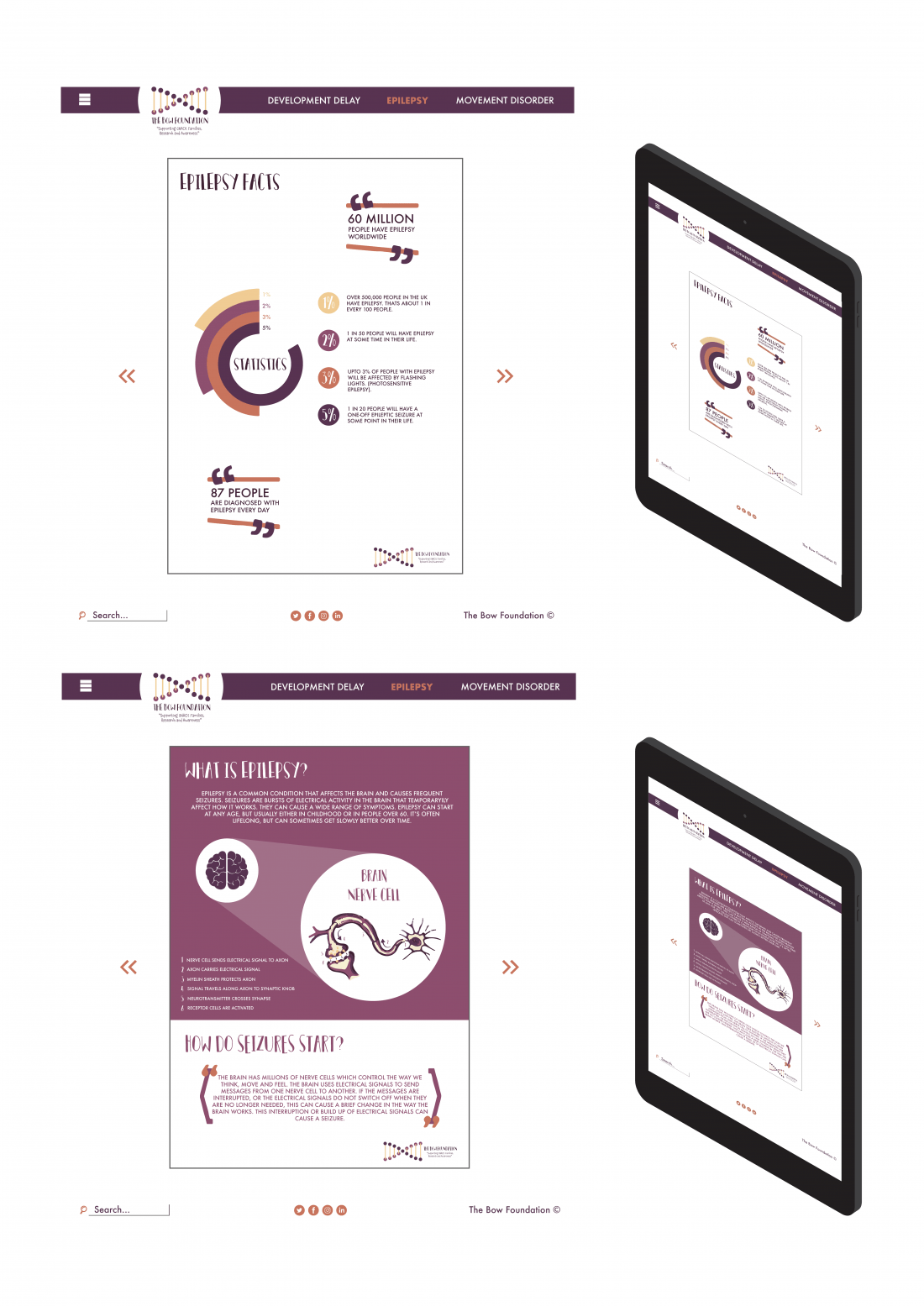
The Bow Foundation: Epilepsy Posters
2/6 Visuals of how the webpage will work with the Epilepsy Seizure posters.
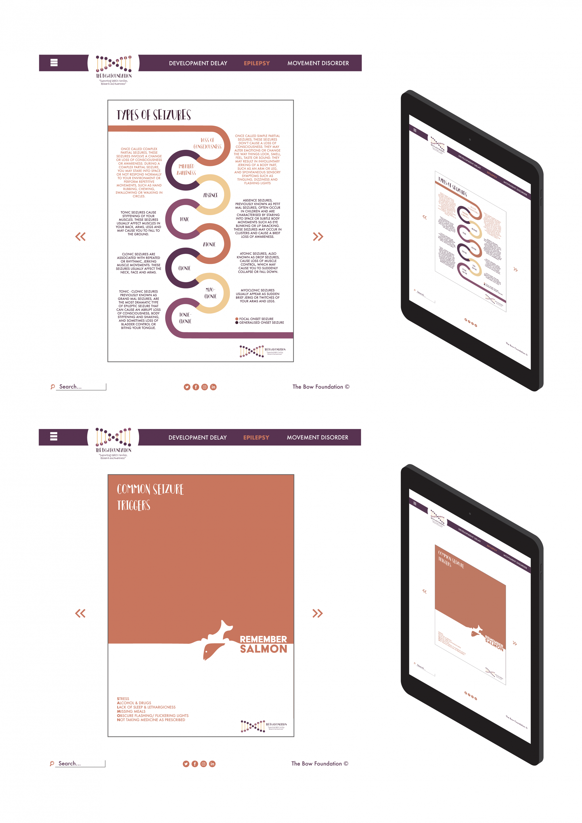
The Bow Foundation: Epilepsy Posters
4/6 The posters are fun and friendly with different designs to ensure the target audience stays interested.
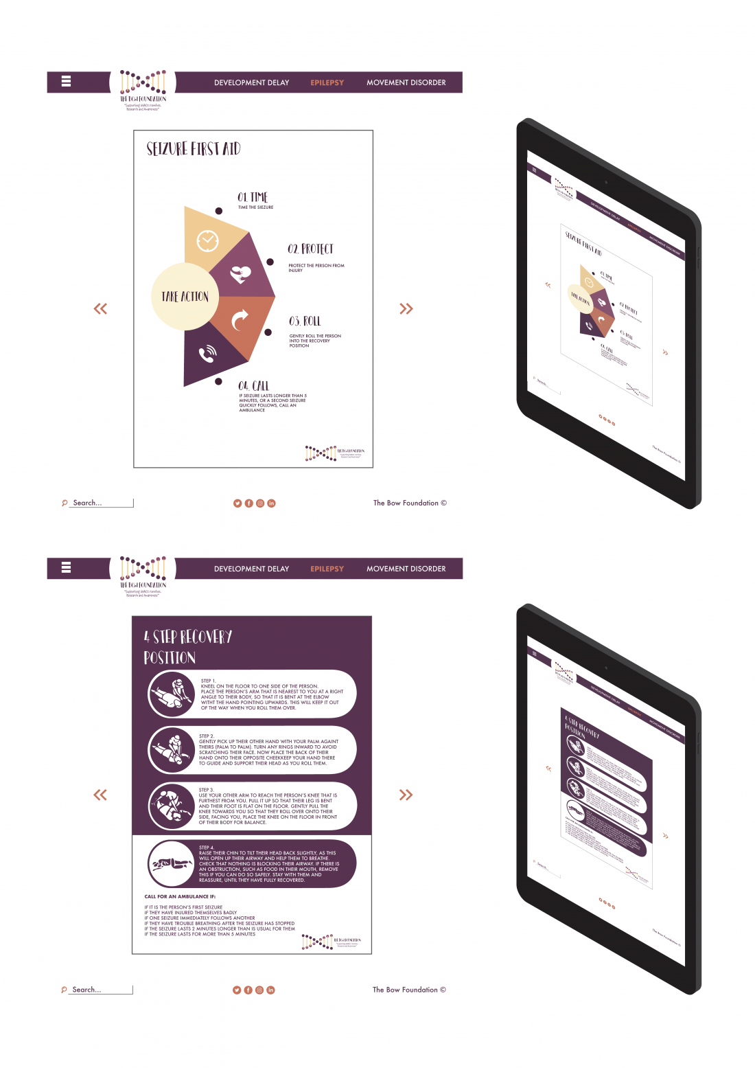
The Bow Foundation: Epilepsy Poster
6/6 Strict Brand guidelines have helped to structure the website and posters to give the sense they belong together strengthening The Bow Foundation Brand. The bright, bold colours attract attention from they target audience which leads them to read the posters which is slowly educating them on Epilepsy and Seizures as they progress through the 6 poster show reel.
Hannah Brumby
This project has focused on epileptic seizures and how to help when one is taking place. I chose to rebrand the Bow Foundation Charity which supports families, research and awareness of GNAO1.
GNAO1 is broken down into three main parts: 1). Development Delay 2). Epilepsy 3). Movement Disorder I decided to focus solely on epilepsy, as there is a larger audience I could target (many people know or know of someone who suffers from epilepsy). The only ask was to learn how to help first aid an epileptic seizure safely. This work has allowed me to rebrand an existing charity, raise awareness and educate the target audience about epileptic seizures. Creating and following strict brand guidelines has strengthened the project, enabling the audience to associate the chosen colours with the charity. Purple was very important due to the association it already had with epilepsy. I built on this association by adding different shades of purple as well as orange to help highlight aspects in the design. My aim is to eventually work in the branding industry, as I love the process of experimenting with styles, colours, fonts and target audience personas and helping new or existing brands improve.